
Designing a compact interior often feels like a frustrating game of spatial Tetris. When square footage is severely limited, there is a common tendency to sacrifice personal style in favor of pure, utilitarian function, or conversely, to prioritize aesthetics so much that the room becomes virtually unlivable. However, an inspiring interior does not require palatial dimensions. The secret to mastering a modest floor plan lies in intentionality – understanding how the human eye processes boundaries, light, and proportion. By implementing strategic design choices, you can engineer an environment that refuses to compromise on character while simultaneously optimizing every available inch. A highly functional room can still look meticulously curated. Below are ten transformative concepts that strike the perfect equilibrium between high-end design and everyday practicality.
1. The Vertical Axis: Floor-to-Ceiling Shelving
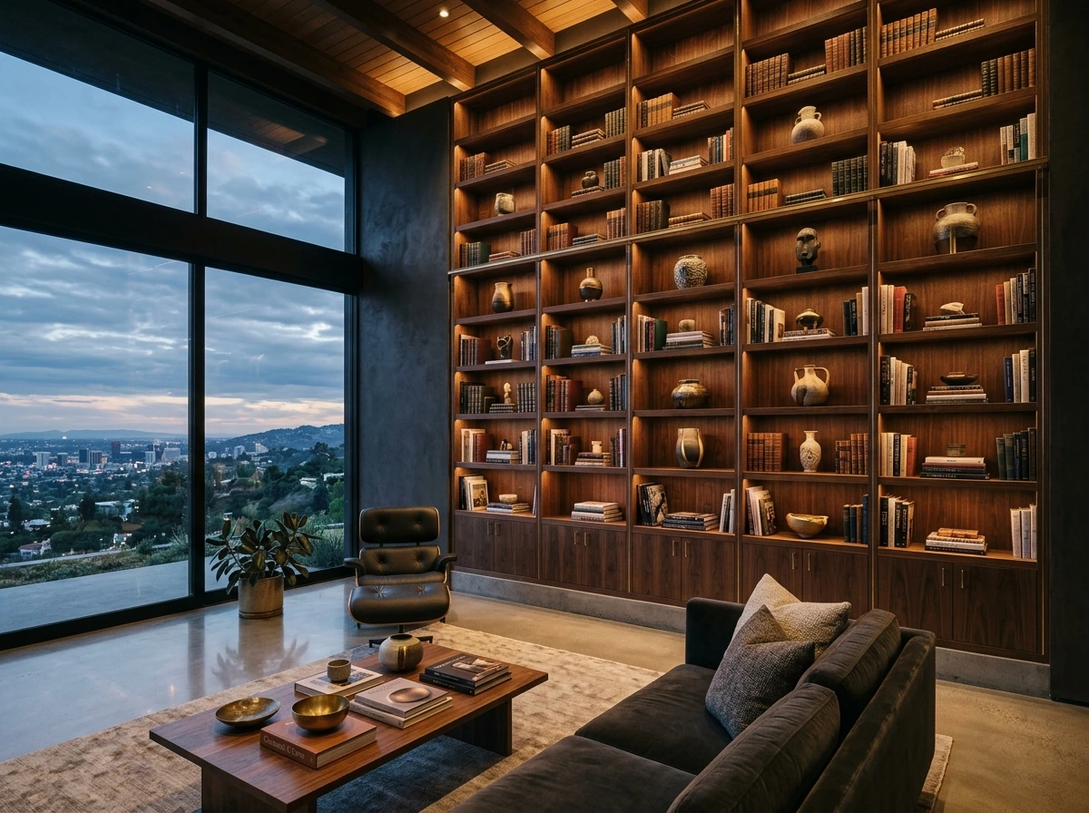
When horizontal floor space is exhausted, the only direction left to go is up. Installing custom or modular shelving that stretches from the baseboards to the ceiling capitalizes on entirely unused real estate. Visually, tall vertical lines immediately draw the gaze upward, emphasizing the height of the architecture rather than the limitations of the floor plan. This approach provides abundant storage for books and curated objects while preserving essential walking paths.
2. Strategic Mirror Placement
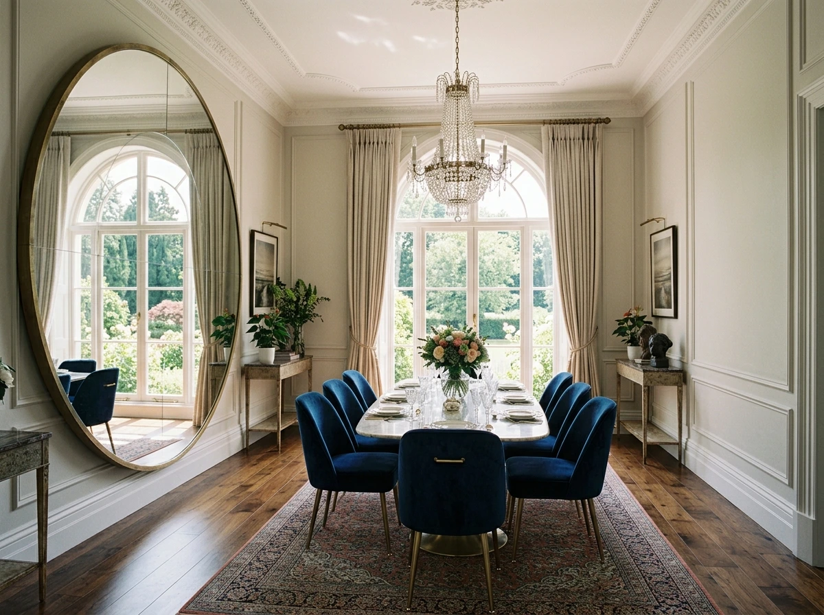
Mirrors are celebrated in design for their reflective qualities, but their placement dictates their effectiveness. Positioning a large, high-quality mirror directly opposite a window bounces natural daylight deep into the interior, significantly brightening shadowy corners. Furthermore, an oversized floor mirror leaning against a wall mimics the appearance of an open doorway or an adjacent hallway, tricking the brain into perceiving a continuation of the environment and establishing compelling visual depth.
3. Low-Contrast, Tonal Color Palettes
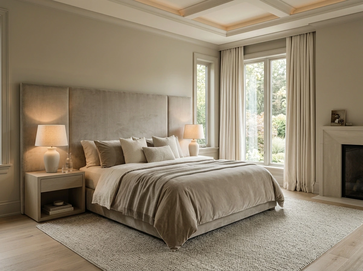
A fragmented color scheme can visually chop a room into smaller, distinct zones. Instead, embrace a tonal or monochromatic approach. When the walls, baseboards, window trims, and even large upholstery pieces share a closely related hue, the sharp transitions between different surfaces disappear. The eye glides smoothly across the space without encountering jarring interruptions. This seamless layering of similar shades results in a serene, cohesive atmosphere where structural boundaries gently blur into the background.
4. Hardworking Multi-Functional Furniture
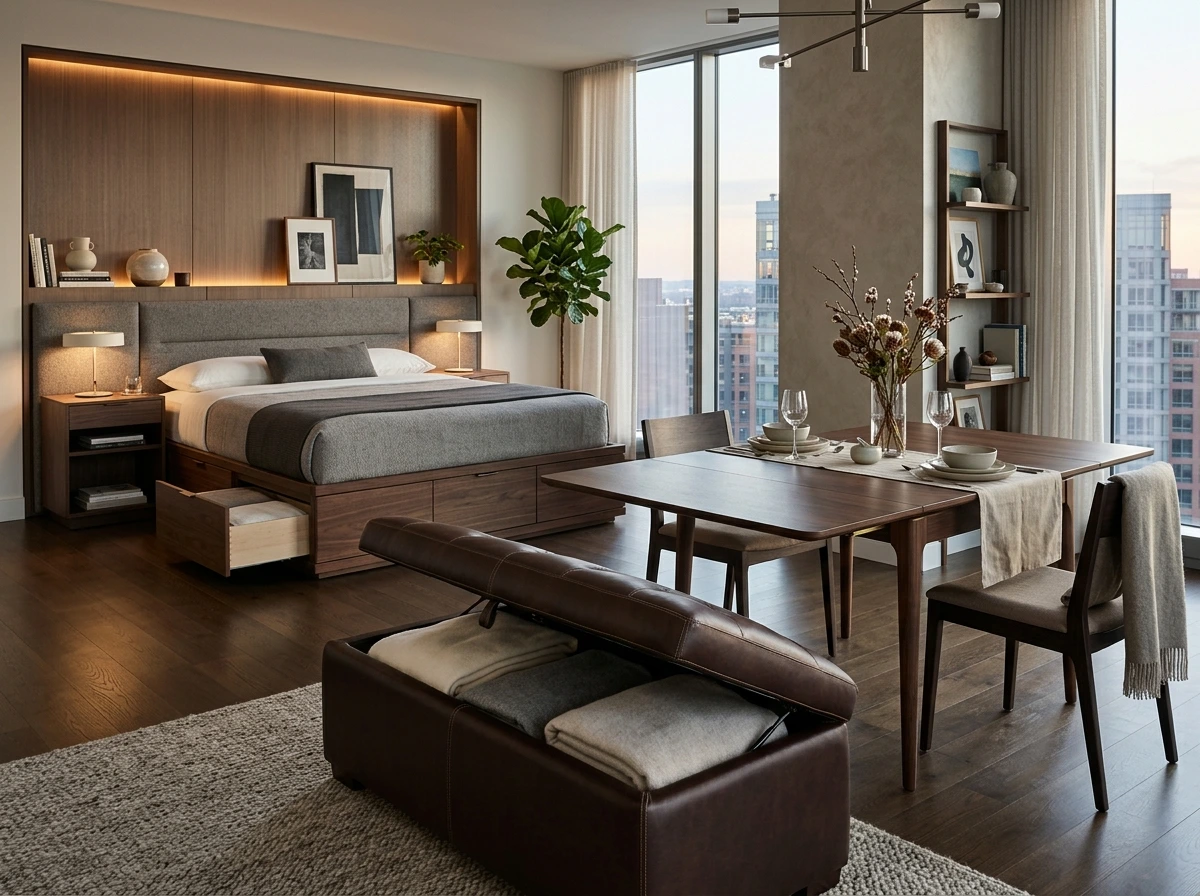
In a restrictive layout, every piece of furniture must justify its presence by offering dual purposes. Think of plush storage ottomans that hide seasonal blankets, elegant drop-leaf dining tables, or platform beds featuring integrated cabinetry. Crucially, prioritizing function does not mean settling for dorm-room aesthetics. Select sophisticated designs where the mechanical or storage elements are completely concealed, ensuring the item maintains a sleek, refined silhouette while covertly managing everyday necessities.
5. Bold Proportions Over Miniature Decor
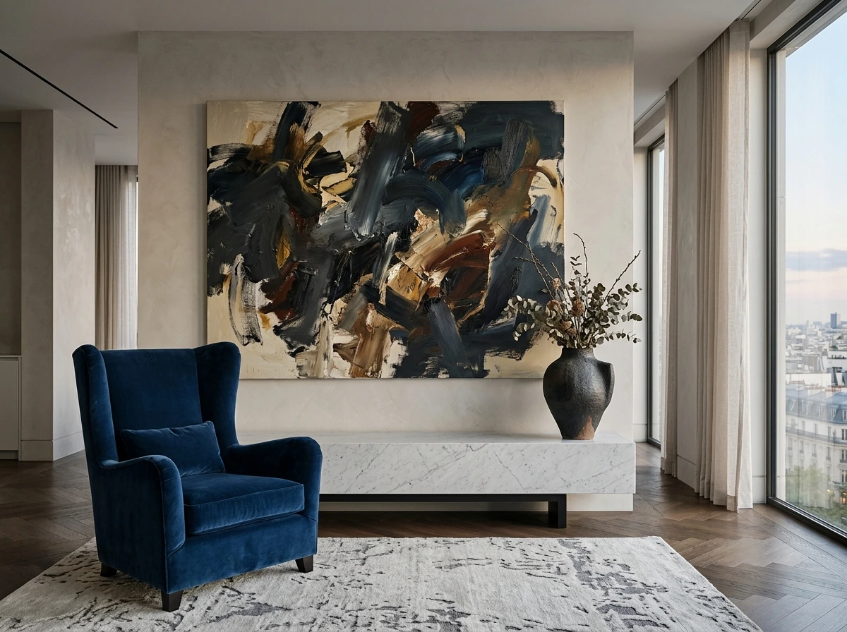
A frequent misstep in modest layouts is utilizing scaled-down furniture and tiny accessories in an attempt to save room. Unfortunately, a multitude of small items inevitably registers as chaotic clutter. Counterintuitively, incorporating fewer, larger-scale pieces – such as a singular oversized canvas, a substantial sculptural vase, or a generously sized armchair – anchors the environment. These bold focal points command attention, establishing a deliberate and confident aesthetic rather than looking like an assortment of leftovers.
6. Layered and Wall-Mounted Lighting
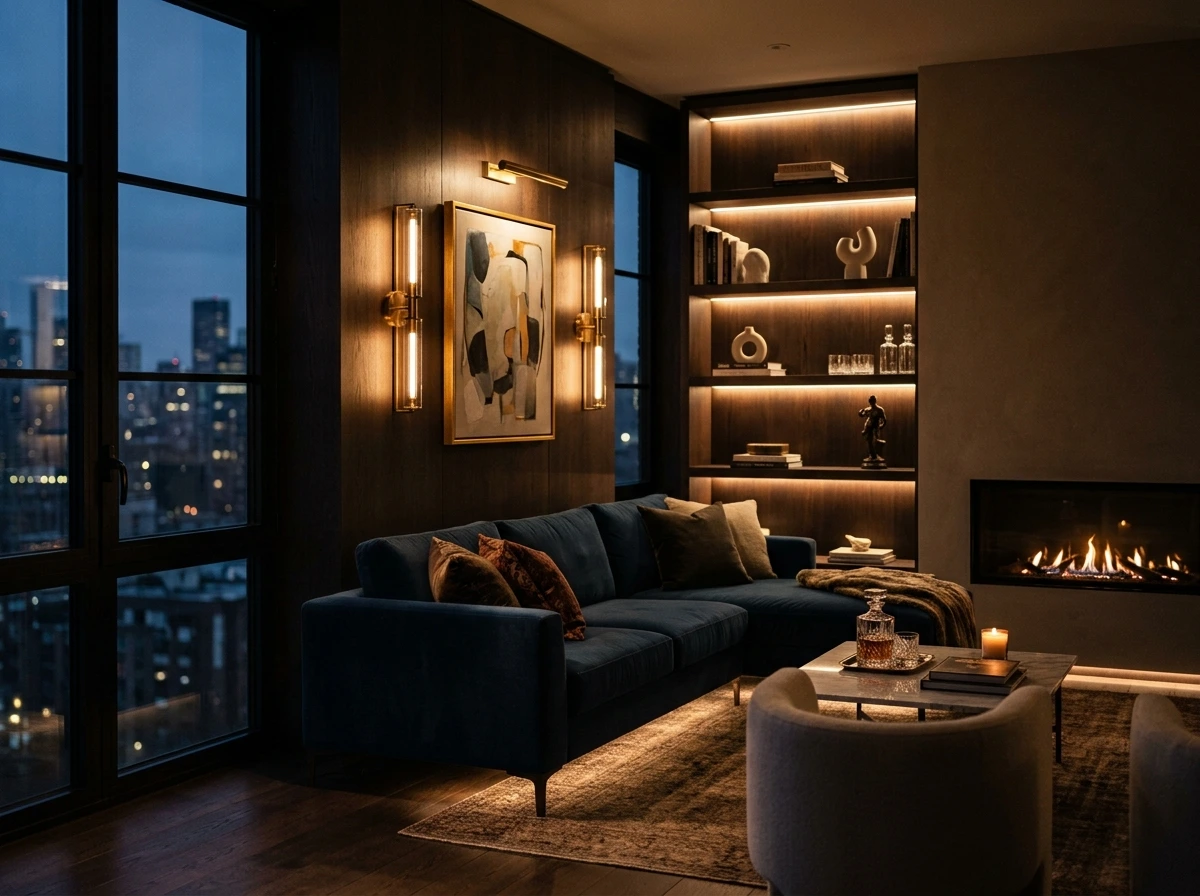
Relying solely on a single overhead fixture casts harsh, unflattering shadows that highlight the room’s constraints. A sophisticated lighting scheme requires multiple layers. Swap bulky table lamps for hardwired or plug-in wall sconces to instantly free up valuable surface area on nightstands and side tables. Combine these with low-level ambient floor lamps or hidden LED strip lighting under shelves to introduce pockets of warmth and multidimensionality, entirely altering the room’s evening mood.
7. The Illusion of Lucite and Glass
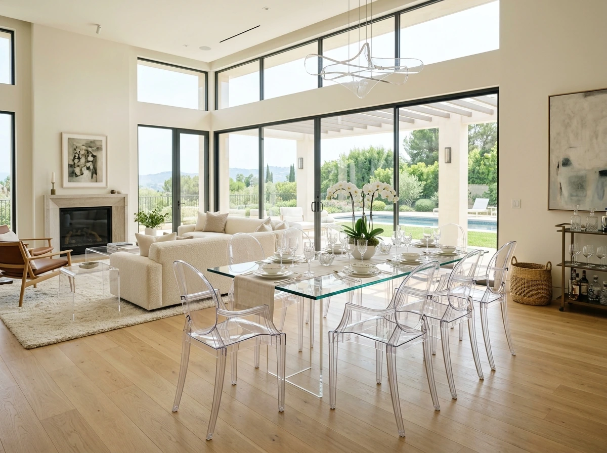
When you need the functionality of a surface but cannot afford the visual bulk, transparent materials are invaluable. Incorporating acrylic dining chairs or a minimalist glass coffee table introduces essential utility without obstructing sightlines. Because light passes directly through these materials, they essentially occupy zero visual weight. This transparency allows the floor and surrounding textiles to remain fully visible, keeping the atmosphere feeling light, airy, and entirely unburdened.
8. Floating Furniture and Fixtures
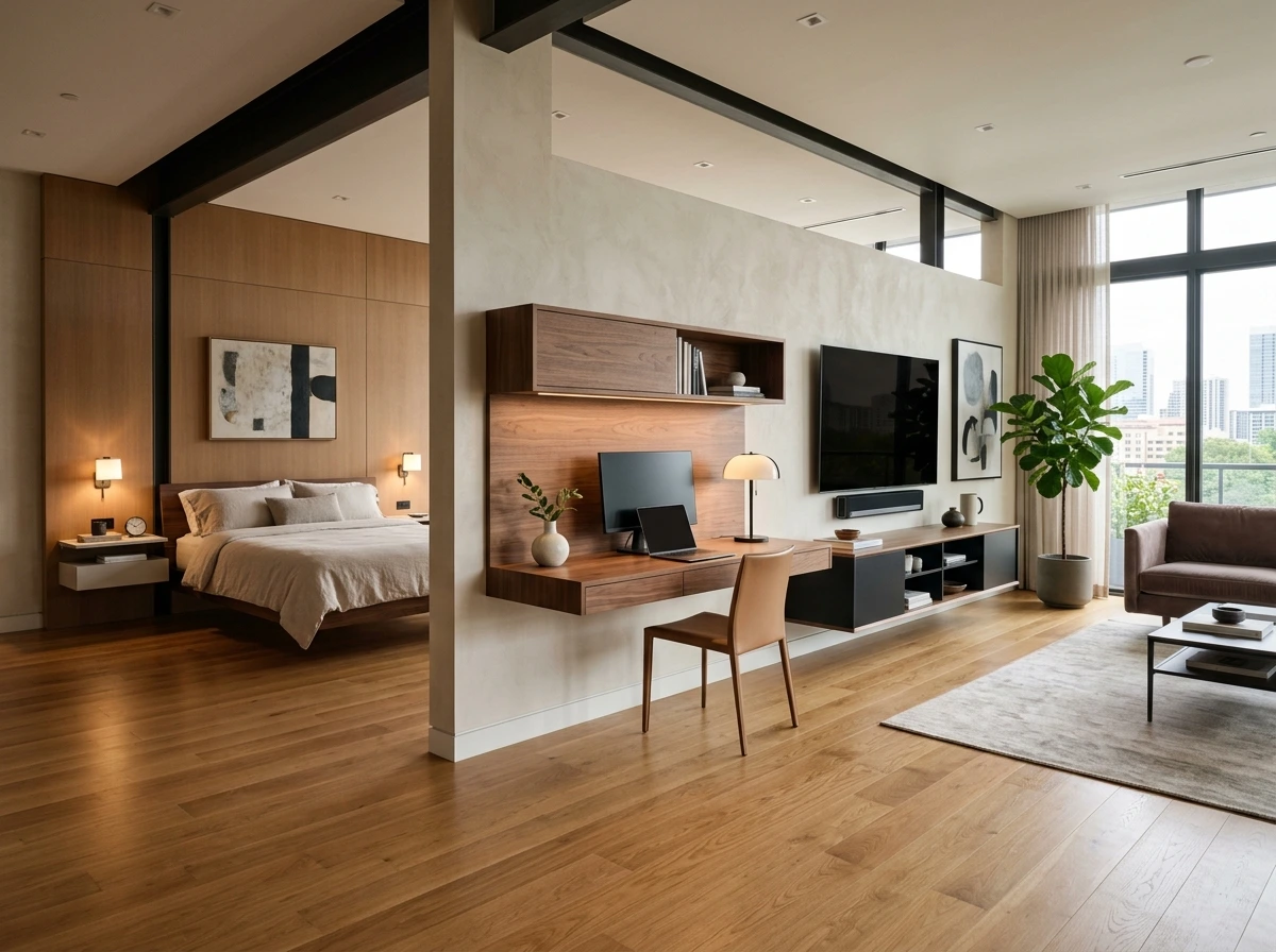
Exposing as much continuous flooring as possible is a powerful psychological trick in interior design. Wall-mounted desks, floating media consoles, and cantilevered nightstands eliminate the heavy legs and solid bases that typically block the floor. When the floor surface visibly extends underneath the furniture to the wall, the mind interprets the footprint as uninterrupted and expansive. Additionally, it streamlines the cleaning process and lends a distinctly modern, custom-built flair to the home.
9. Generous Rug Sizing
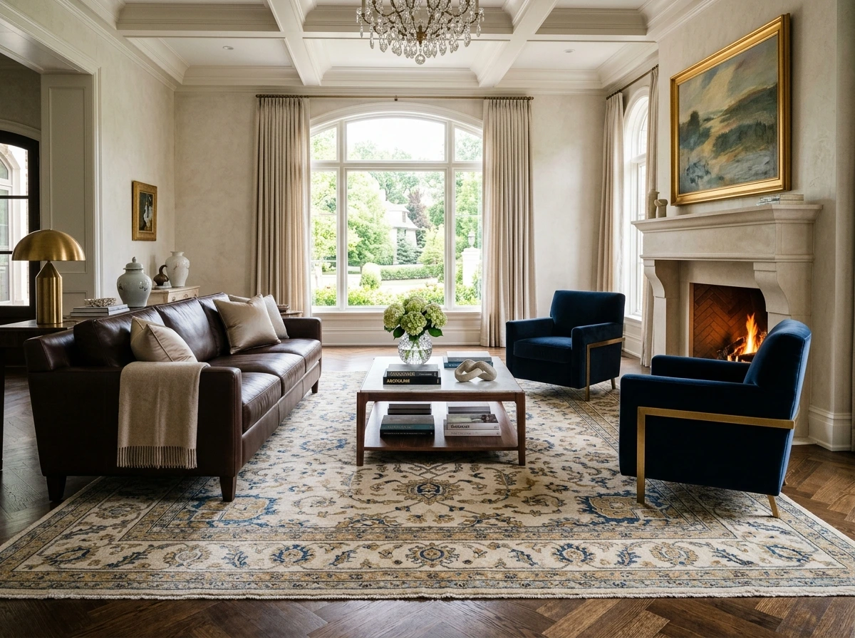
It is tempting to purchase a small area rug for a compact footprint, but doing so fragments the layout into disjointed, floating islands. A rug should be generous enough to slip comfortably under the front legs of all primary seating arrangements or encompass the entire bed frame. This unifying element visually groups the furniture together, establishing one cohesive, generously proportioned zone and anchoring the overall architecture with deliberate intention.
10. High and Wide Drapery Installation
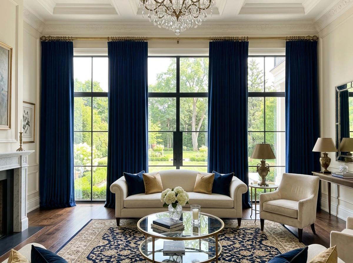
Window treatments have the power to alter structural perceptions. Hanging drapery rods just a few inches below the ceiling line – rather than directly above the window casing – elongates the visual height of the walls. Furthermore, extending the rod several inches past the sides of the window allows the curtains to stack over the drywall, ensuring maximum daylight penetrates the glass. This simple tailored installation mimics the grandeur of floor-to-ceiling architectural windows.
Mistakes That Make Small Rooms Feel Smaller
- Pushing Everything Flush Against the Walls: Lining the perimeter with furniture creates an awkward, cavernous dead space in the very center and strictly defines the room’s rigid edges. Pulling sofas or accent chairs just a few inches inward allows the architecture to breathe and establishes a far more intimate, conversational layout.
- Ignoring the Traffic Flow: Placing an oversized coffee table or a protruding bookshelf directly in a natural walking pathway introduces daily friction. When you physically have to navigate an obstacle course to cross the room, the environment perpetually feels cramped and functionally hostile. Always prioritize clear, sweeping navigation routes.
- Utilizing Heavy, Opaque Textiles: Dressing windows in thick, dark velvets or heavily patterned, opaque drapes traps the room and swallows incoming natural daylight. These fabrics often act like dark, imposing walls. Swapping them for light-filtering linen or sheer panels invites the outdoors in, maintaining a breezy and open sensibility.
Frequently Asked Questions
Can I use dark paint colors in a compact room?
Absolutely. While light hues reflect illumination, deep shades like charcoal, navy, or forest green can create a highly sophisticated, moody atmosphere. This technique, often referred to as “color drenching” (painting walls, trim, and ceiling the same dark tone), obscures harsh corners and shadows, generating an enveloping, jewel-box effect that feels incredibly intentional.
How do I display my personal collections without looking cluttered?
The key is intentional grouping rather than scattering. Instead of dispersing decorative objects across every available tabletop or windowsill, consolidate them onto one dedicated floating shelf, a designated tray, or inside a glass-front cabinet. This localized concentration turns assorted items into a single, curated gallery display, giving the eye a distinct place to rest.
What is the optimal furniture layout for a tiny bedroom?
Prioritize positioning the bed on the longest, uninterrupted wall to establish a clear focal point. Replace bulky bedside tables with wall-mounted shelves or sconces to minimize floor impact. Most importantly, ensure there is a minimum of 24 to 30 inches of walking clearance at the foot of the bed to prevent the space from feeling uncomfortably tight.