
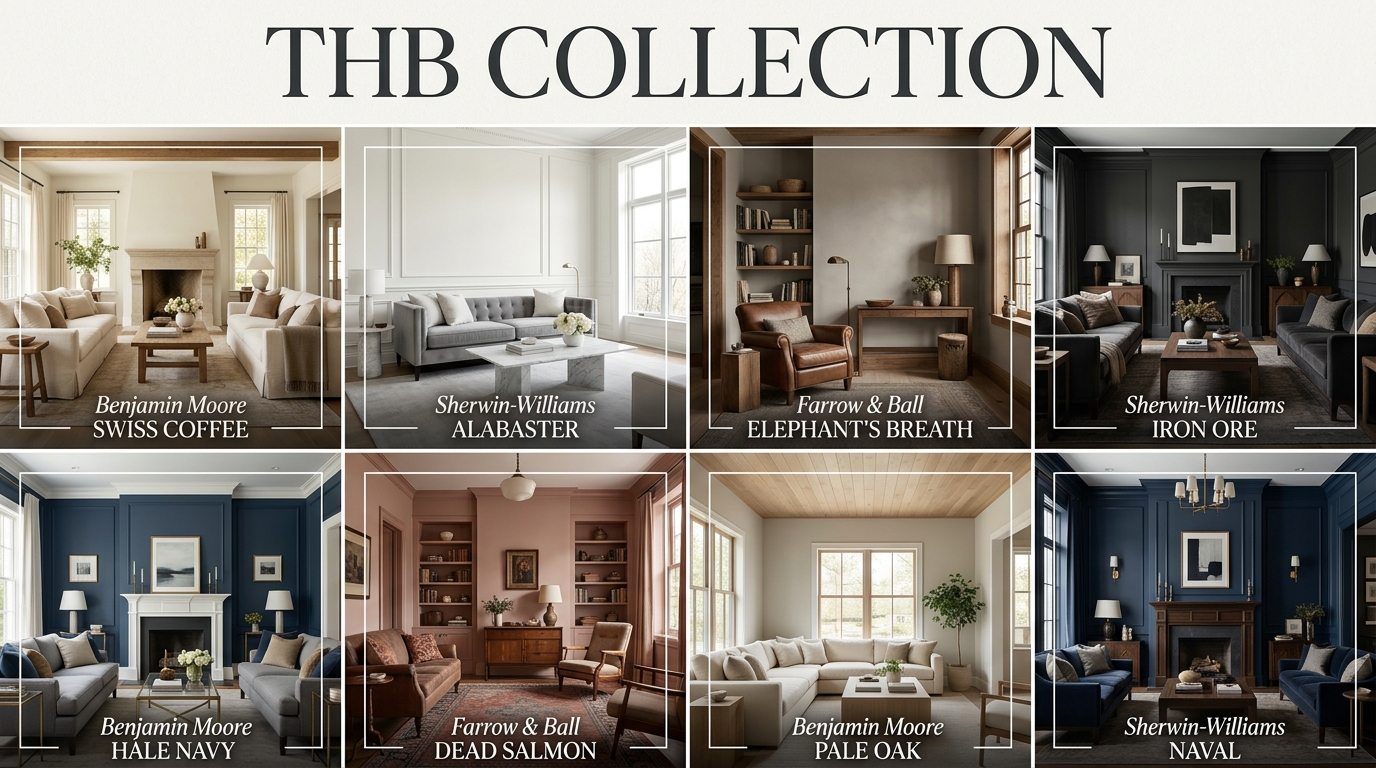
Finding the right wall color is the most transformative step in any home renovation project. The shade you choose does far more than just cover the drywall; it reflects natural light, alters your perception of the room’s scale, and sets the psychological mood for your entire household. If your current space feels a bit washed out, cold under LED bulbs, or visually chaotic, swapping out the palette can instantly ground the room and tie your furniture arrangement together.
When narrowing down your swatches, balancing undertones with your room’s orientation is key to achieving a professional finish. You can explore dozens of beautifully curated spaces and foundational styling rules on the Trendy Home Bloom homepage to jumpstart your color journey. Ultimately, the perfect paint color acts as a cohesive backdrop that lets your fabrics breathe, your artwork pop, and your daily life flow in a space that feels uniquely yours.
1. Benjamin Moore Swiss Coffee (OC-45)
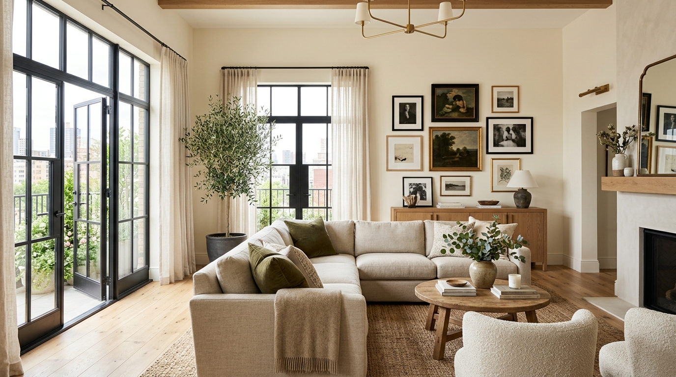
This iconic, warm creamy white is a favorite among interior designers for its ability to make large spaces feel cozy yet bright. It features soft yellow and green undertones that prevent it from ever looking stark, sterile, or clinical under bright daytime sun. Swiss Coffee works beautifully in open-concept layouts, bouncing light across the floor plan while offering a welcoming canvas for natural oak accents and linen fabrics. It is an absolute classic for achieving an effortless, high-end gallery aesthetic.
2. Sherwin-Williams Alabaster (SW 7008)
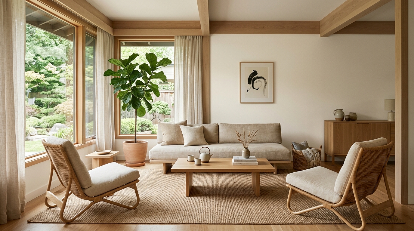
Alabaster is a benchmark warm white that strikes a flawless balance between crisp and cozy. It has a slight beige undertone that softens the glare in south-facing rooms, ensuring the walls feel calm and peaceful throughout the day. This versatile shade bridges the gap between traditional architectural details and modern, low-profile furniture silhouettes beautifully. To see how a soft white canvas like this can ground a relaxed, texture-rich space, look through these essential japandi interior design ideas for matching material inspiration.
3. Farrow & Ball Elephant’s Breath (No. 229)
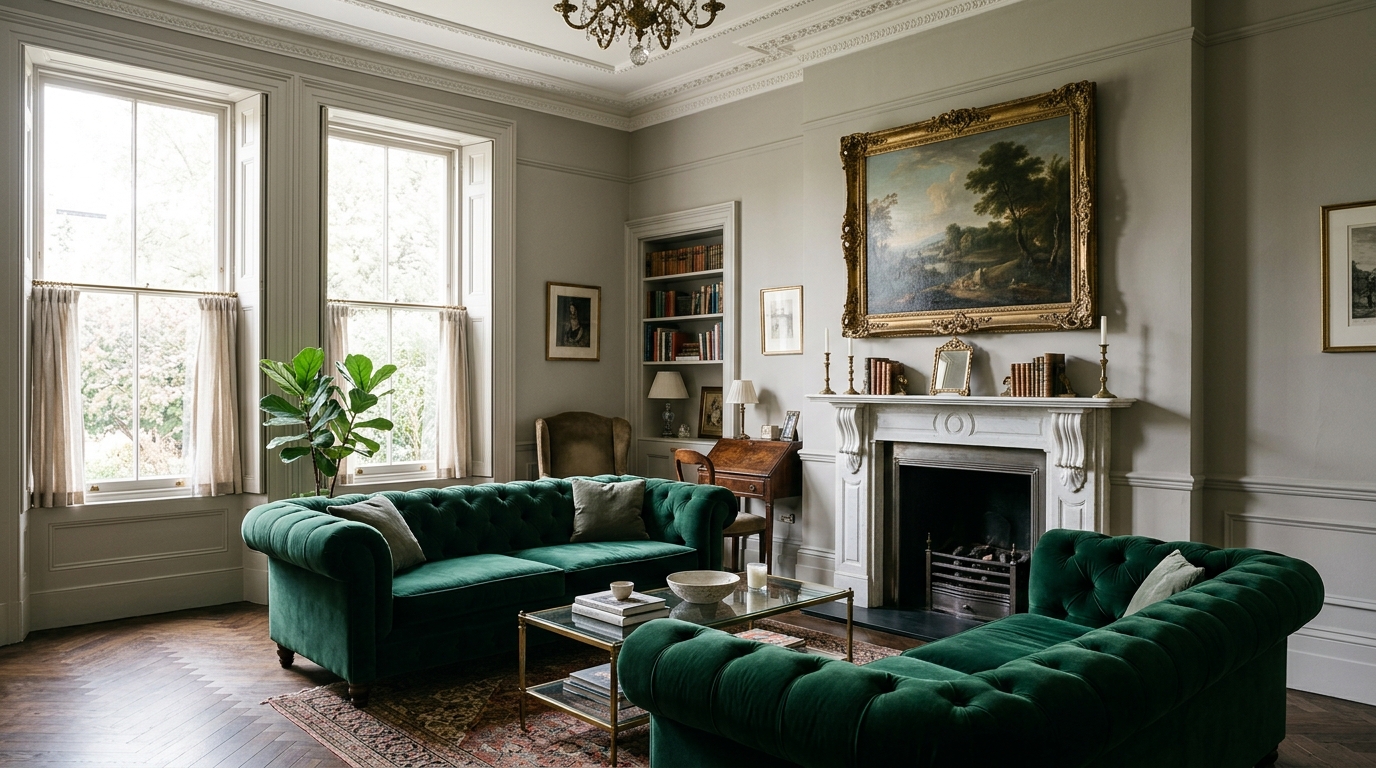
This sophisticated, mid-toned gray is infused with a distinct warm magenta undertone that makes it shift beautifully from morning to night. In bright natural light, it reads as a clean, contemporary greige, while in evening lamplight, it deepens into a moody, enveloping stone tone. It introduces an undeniable European elegance to the room, acting as a rich backdrop that makes velvet sofas and tarnished gold frames look incredibly premium.
4. Sherwin-Williams Repose Gray (SW 7015)
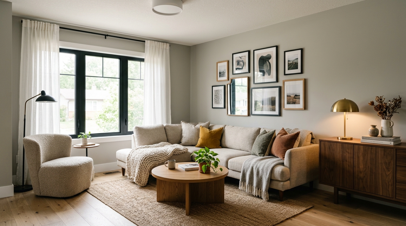
Repose Gray is widely celebrated as a true chameleon gray that adapts effortlessly to its surroundings. It contains subtle hints of brown and purple, keeping it firmly in the warm gray family without ever looking icy or blue. This dependable neutral works wonders in compact spaces, visually expanding the walls while maintaining a clean, cohesive visual line. It provides a crisp, modern feel that still leaves plenty of room for cozy textiles.
5. Benjamin Moore Revere Pewter (HC-172)
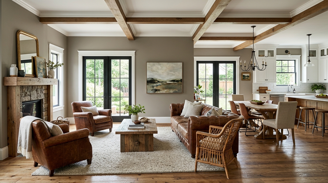
Revere Pewter is an absolute legend in the world of transitional design, offering a rich, saturated greige that instantly grounds a room. It is a fantastic choice for open floor plans that lack heavy architectural trim, as the paint itself brings structural weight to the walls. It contrasts beautifully against crisp white baseboards and coordinates flawlessly with distressed leather furniture and rustic wood finishes.
6. Sherwin-Williams Iron Ore (SW 7069)
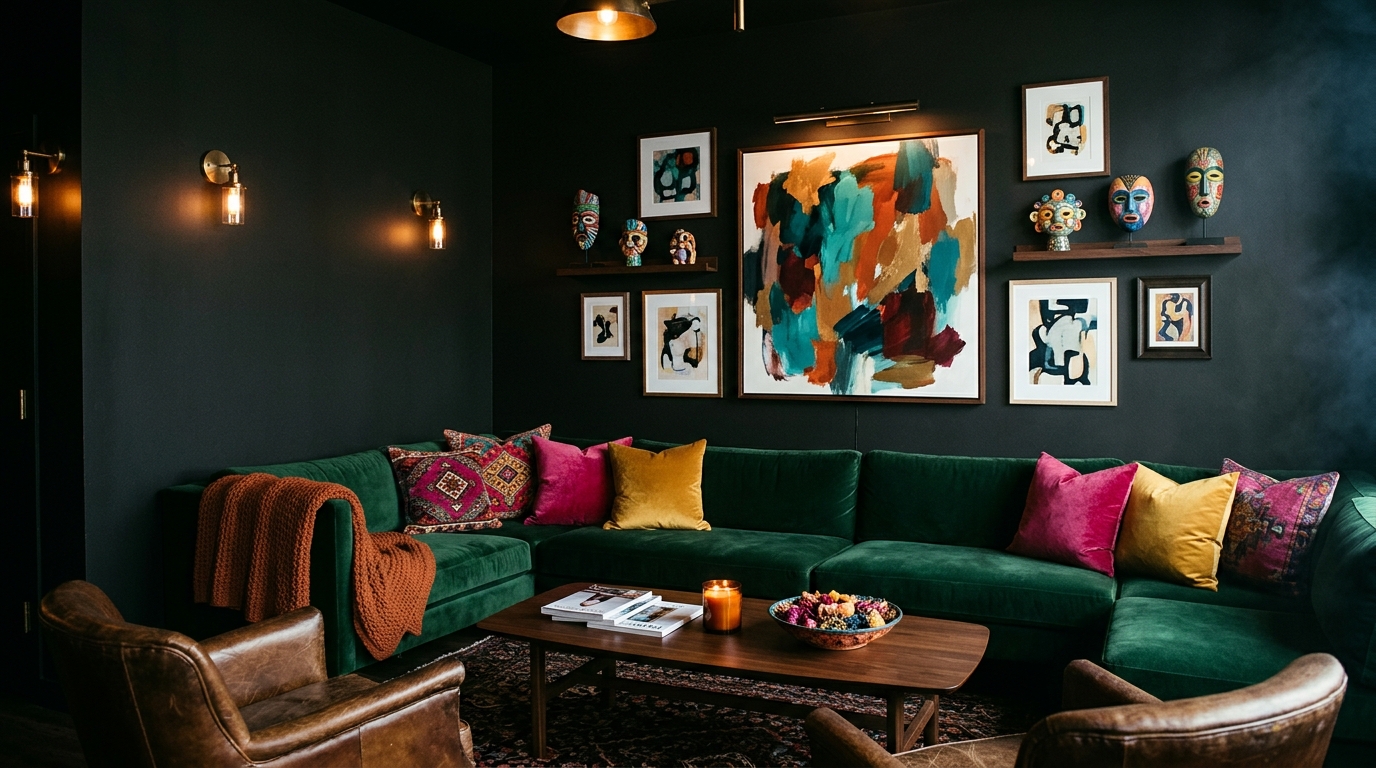
If you are ready to embrace a dramatic, high-contrast look, this deep, velvety charcoal black is a show-stopping choice. Iron Ore is slightly softer than a true jet black, featuring subtle warm undertones that keep it from feeling flat, harsh, or cave-like on a large wall. Using this bold shade on a prominent accent wall or enveloping the entire room creates an intimate, cocoon-like atmosphere that makes colorful textiles and vibrant artwork pop like a museum display.
7. Benjamin Moore Hale Navy (HC-154)
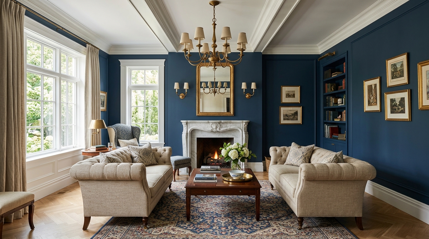
Hale Navy is widely considered the ultimate deeply saturated blue, valued for its classic, nautical authority and timeless appeal. It features a heavy gray base that tones down the brightness, ensuring it remains deeply sophisticated rather than preppy or loud. This stunning shade brings an immediate sense of history and architectural permanence to your main seating arrangement, pairing beautifully with warm brass light fixtures and light oak floors.
8. Farrow & Ball Dead Salmon (No. 28)
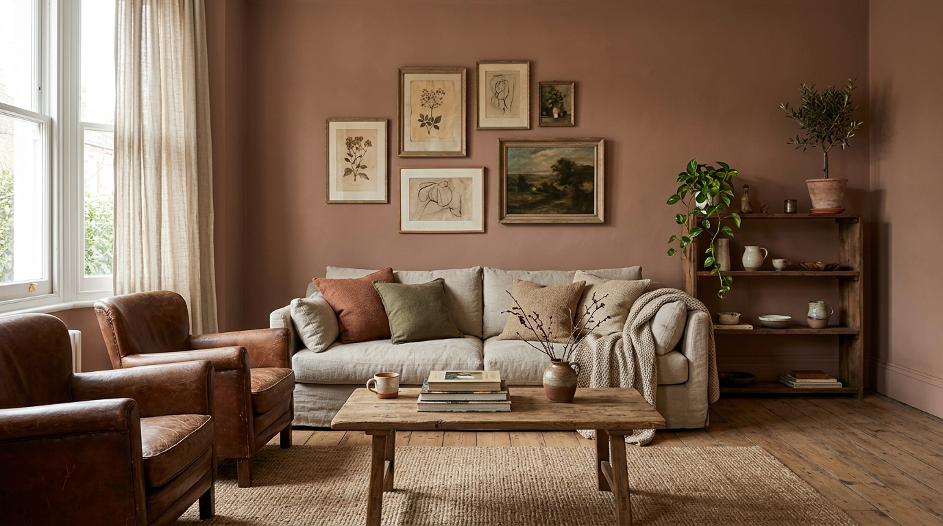
Do not let the unusual name scare you away; this rich, earthy shade is an incredibly chic blend of muted terracotta, soft brown, and deep mushroom. It provides a matte, velvety suede appearance that brings immense historical character and cozy warmth to bare walls. This unique tone feels deeply grounding and looks spectacular paired with asymmetrical vintage art displays and low-slung, casual seating arrangements.
9. Benjamin Moore Pale Oak (OC-20)
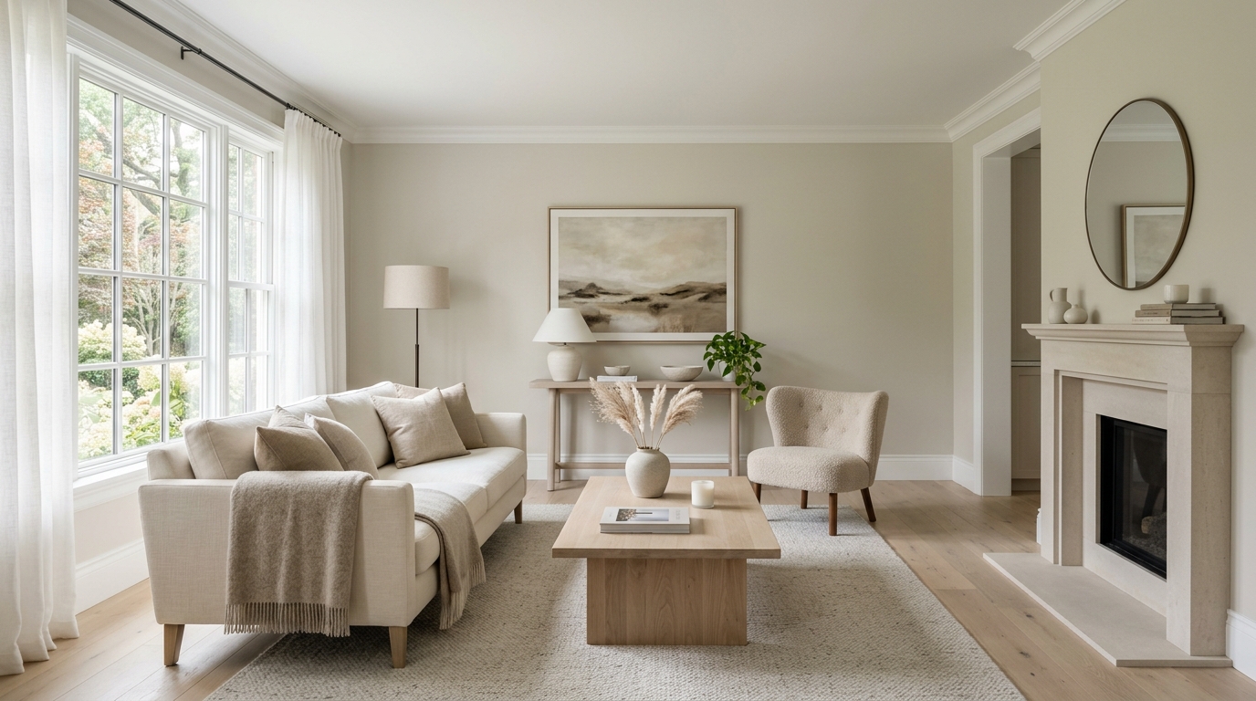
Pale Oak is an exceptionally elegant, light greige that mimics the soft, neutral tones of natural white oak timber. It is the perfect remedy for dark, north-facing rooms that can easily make traditional grays look muddy or dingy. This bright shade reflects light beautifully without ever washing out, creating a serene, airy environment where your mind can rest and your household clutter disappears into the background.
10. Sherwin-Williams Sea Salt (SW 6204)
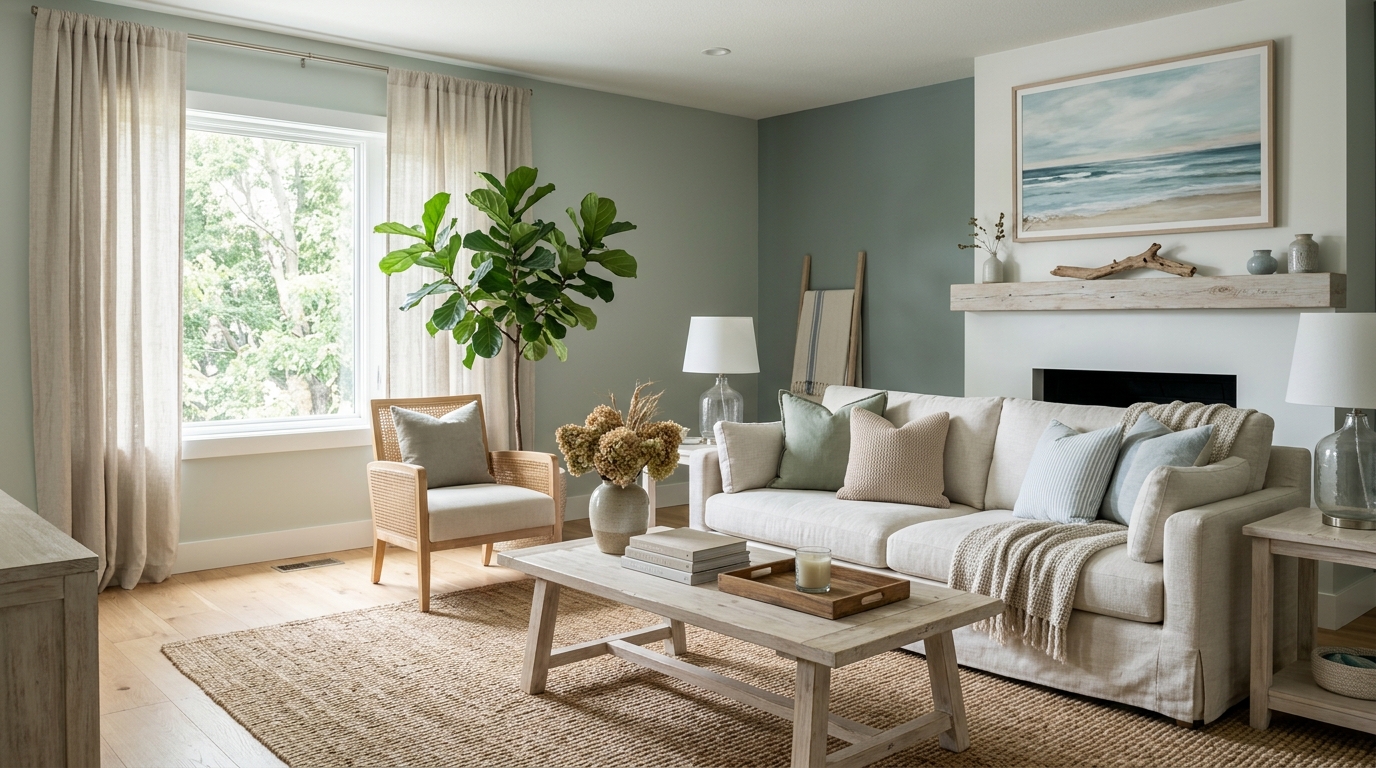
This muted, under-the-radar coastal shade is a soft blend of gray, green, and a tiny hint of light blue. Sea Salt behaves like an absolute chameleon, shifting its prominent color story depending on the time of day and the incoming natural light. It injects a lovely, organic freshness into the room that feels calming and peaceful, making it an incredible partner for woven jute rugs and airy linen drapes.
11. Benjamin Moore Chelsea Gray (HC-168)
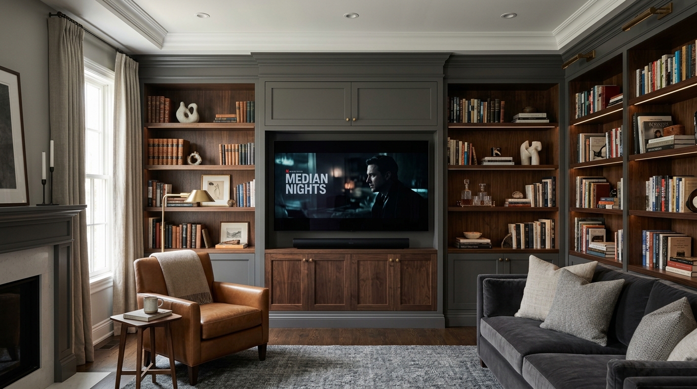
Chelsea Gray is a rich, medium-to-dark gray that carries strong, sophisticated charcoal undertones without looking cold. It brings a crisp, graphic anchor to a living space, working beautifully on built-in library cabinets or as a full-room wrap. For a deep dive into matching deep grays with professional media setups, explore our creative TV wall design ideas to find stunning, cohesive color combinations.
12. Farrow & Ball Green Smoke (No. 47)
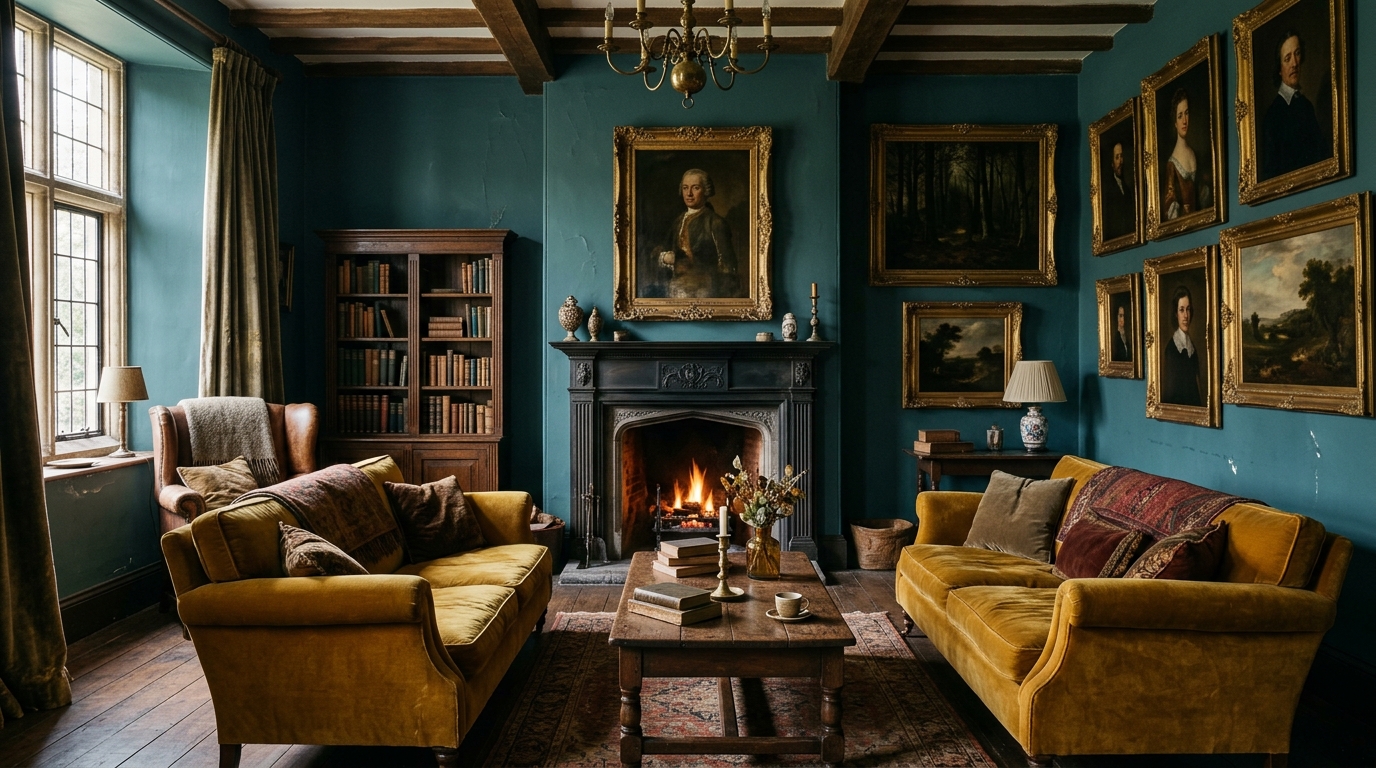
This deep, smoky blue-green evokes the mystery of a dense forest landscape at twilight, making it an exceptional choice for a moody sanctuary. Green Smoke is highly saturated yet feels incredibly peaceful, providing an old-world charm that highlights the warmth of your wood grains. It serves as a striking backdrop for vintage velvet sofas and historic oil paintings, enveloping your entire seating group in absolute comfort.
13. Sherwin-Williams Urban Bronze (SW 7048)
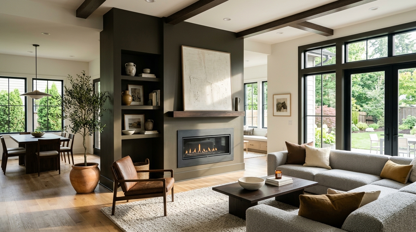
Urban Bronze is a rich, muddy blend of deep charcoal, warm brown, and dark olive green that won paint color of the year for its grounding qualities. It looks uniquely high-end when applied to accent trim, window frames, or a prominent fireplace bump-out. The earthy bronze undertones catch the sunlight beautifully, bringing a permanent, structural weight to modern open-concept floor plans.
14. Benjamin Moore Simply White (OC-117)
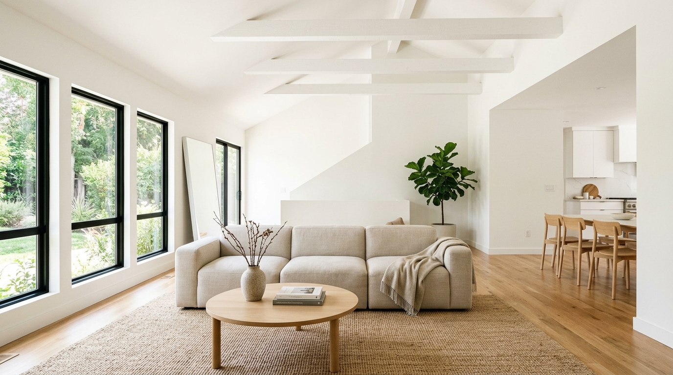
If you are searching for a clean, bright, and crisp white that contains zero heavy yellow or blue undertones, Simply White is the gold standard. It features a tiny hint of warmth that keeps it looking fresh and joyful rather than clinical or cold. This radiant shade is perfect for highlighting complex ceiling structures, maximizing incoming daylight, and creating an open, airy minimalist aesthetic.
15. Sherwin-Williams Tricorn Black (SW 6258)
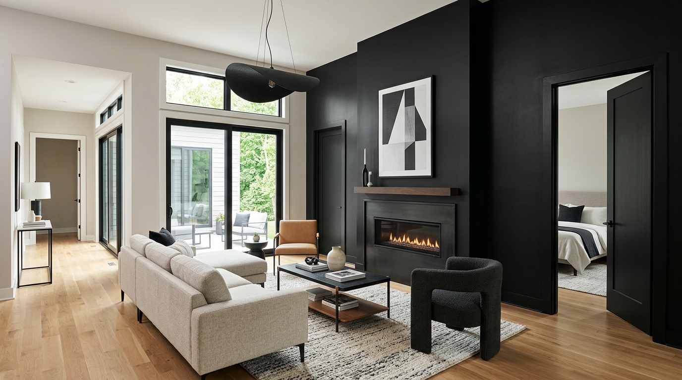
Tricorn Black is a true, absolute jet black that contains no prominent undertones, making it a powerful graphic punch for modern homes. Use it deliberately to anchor your space by painting interior doors, built-in media shelving, or a sleek linear fireplace surround. The flat, deep contrast instantly modernizes surrounding light neutrals, making standard drywall look incredibly intentional and professionally styled.
16. Benjamin Moore Edgecomb Gray (HC-173)
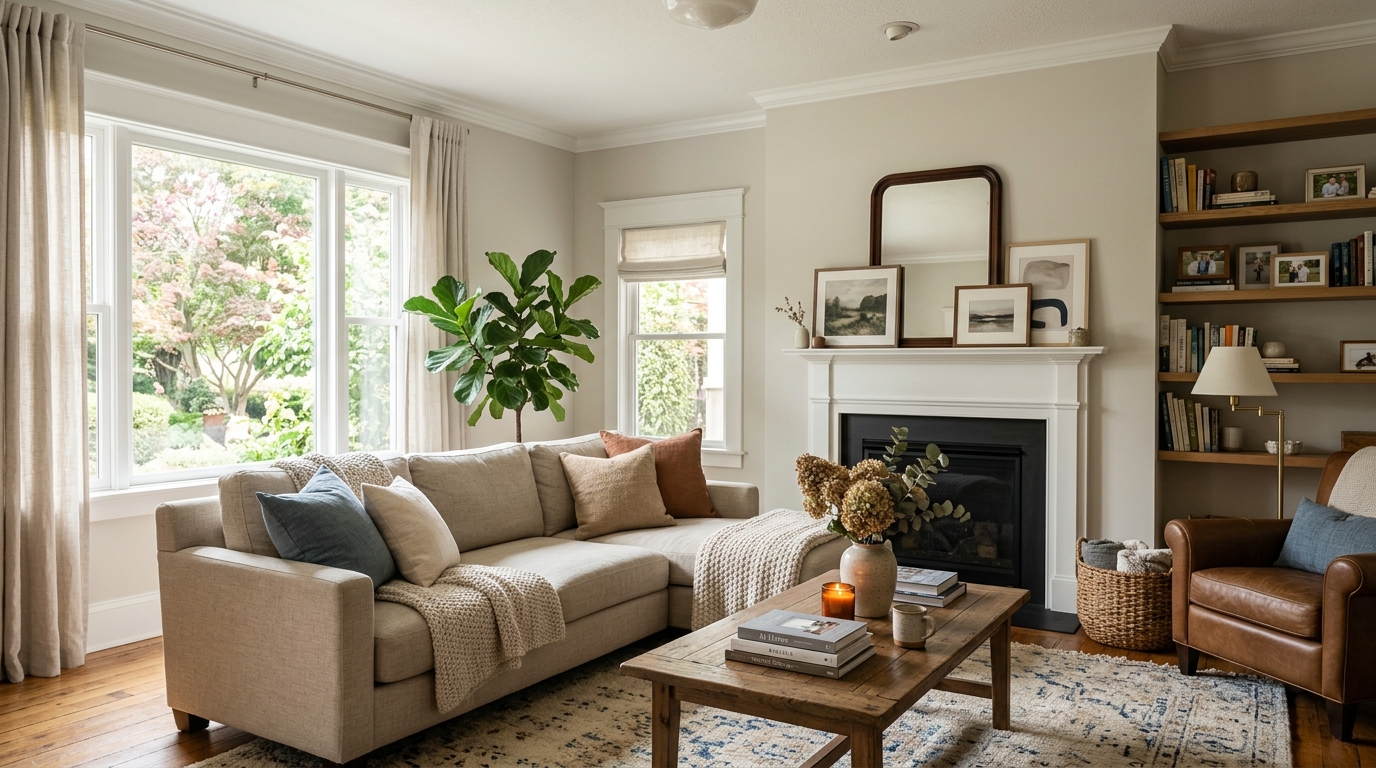
Edgecomb Gray is a soft, organic “stone” color that sits perfectly between a crisp gray and a warm, traditional beige. It is a fantastic foundational shade for homeowners who want to brighten their space without resorting to a stark white. It reads as a gentle, breathable neutral that adapts beautifully to changing seasonal light, making it an excellent all-room choice for busy family spaces.
17. Farrow & Ball Setting Plaster (No. 278)
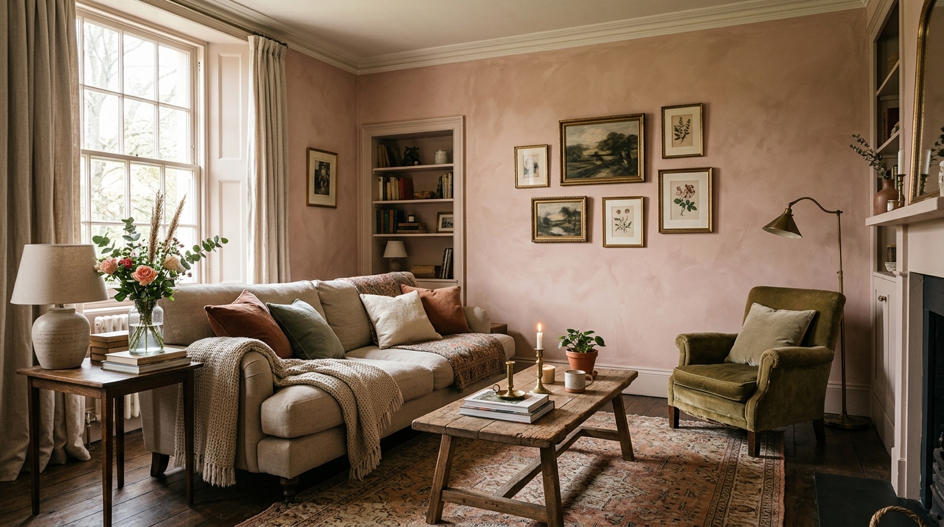
This dusty, muted pink is modeled after the warm, earthy tone of raw historical plaster walls. Setting Plaster acts like a neutral with a tan base, completely avoiding any sugary, pastel, or juvenile pink undertones. It injects an incredible amount of flattering, glowing warmth into the room, making guests look radiant and the entire seating area feel romantic, welcoming, and full of historical character.
18. Sherwin-Williams Accessible Beige (SW 7036)
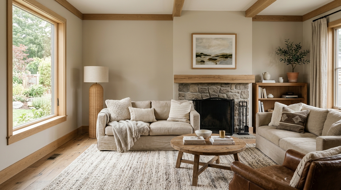
Accessible Beige is a legendary warm neutral that completely redefined how homeowners use beige by stripping out the old, heavy yellow undertones. Instead, it features a clean gray base that keeps it looking modern, crisp, and fresh under any lighting condition. It provides a cozy, reliable canvas that lets white oak trim, linen upholstery, and natural woven textures stand out as focal points.
19. Benjamin Moore Kendall Charcoal (HC-166)
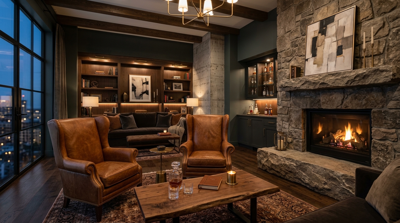
Kendall Charcoal is a luxurious, deep slate gray that brings immediate luxury and executive style to a room. It features a slight green undertone that pairs beautifully with natural stone hearths, raw concrete elements, and rich leather wingback chairs. Using this dark shade on your walls creates an elegant, evening-optimized lounge vibe that makes movie nights and wine gatherings feel uniquely special.
20. Sherwin-Williams Naval (SW 6244)
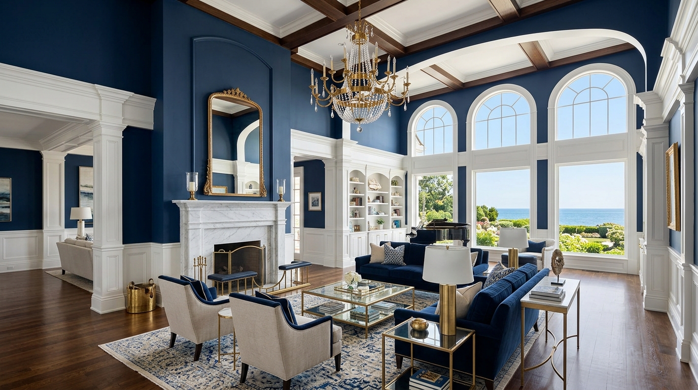
Naval is a deep, majestic navy blue that strikes an incredible balance between traditional structure and modern luxury. It has a regal presence that grounds high ceilings and massive grand rooms, preventing large expansions of drywall from looking cold or empty. Pair this deep blue with polished brass accents, white marble accents, and crisp white trim to create a stunning, high-contrast coastal look.
Tip: Always test your paint samples on large, removable poster boards rather than painting directly onto your drywall. Move the boards around the room to observe how the color shifts in the morning light versus the evening lamplight.
Final Thoughts
Selecting the perfect living room paint color is a rewarding balancing act between understanding your home’s natural architecture and honoring your personal style. Whether you choose a soft, light-evoking white like Alabaster or dive into the deep, dramatic luxury of Iron Ore, the right color unifies your layout instantly. Focus on how the undertones interact with your flooring and furniture textures to ensure the final result looks cohesive and tailored. A thoughtful, well-sampled choice turns your walls into a stunning, long-lasting frame that elevates your daily life and welcomes your family home in absolute comfort.
Frequently Asked Questions
How do you choose between a warm neutral and a cool neutral paint?
Look directly at your flooring and major furniture pieces to guide your choice. If your home features warm white oak floors, camel leather, and linen fabrics, opt for a warm neutral like Swiss Coffee or Accessible Beige. If your layout relies on polished concrete, grey marble, and cool metals, a cool neutral will look much crisper.
What paint finish or sheen is best for living room walls?
A flat or matte finish is ideal for living room walls because it completely absorbs light, hiding minor drywall imperfections and creating a rich, velvety color depth. If you have a busy household with small children or pets, select a high-quality scrubbable matte or an eggshell finish for easy cleanup without adding excessive shine.
How do north-facing rooms affect your interior paint colors?
North-facing spaces receive a cool, bluish natural light that can easily make cool grays look icy, muddy, or gloomy. To counteract this chilly light quality, always select a paint color with a warm beige, yellow, or soft pink undertone, such as Pale Oak or Setting Plaster, to inject essential artificial warmth.
Whether you are refreshing a sun-drenched coastal sunroom or updating a cozy city apartment layout, matching your color palette to your lifestyle changes everything. Explore our comprehensive living room ideas ultimate guide to find professional tips on selecting area rugs, matching window drapery, and mastering the art of arranging your furniture beautifully.