
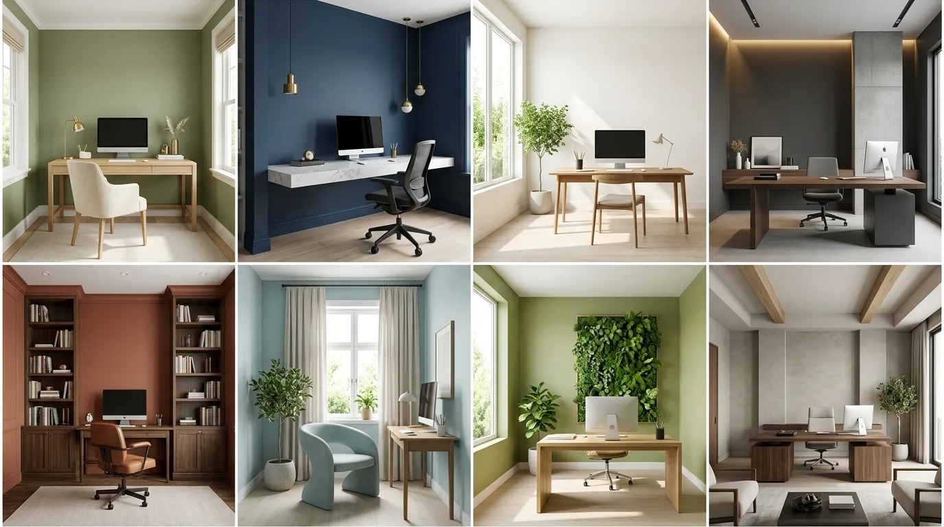
The color palette of a professional workspace dictates far more than its superficial aesthetic value; it is the silent architect of your daily mental stamina, spatial perspective, and creative endurance. In the modern remote-work landscape, painting an office requires a calculated understanding of Spatial Intelligence to construct a true cognitive engine. At Trendy Home Bloom, we treat color curation as a deliberate tool for human optimization – a vehicle to suppress “Visual Noise” and facilitate a deep morning Sensory Reset.
Selecting from the 12 Best Paint Colors for a Productive Home Office is an exercise in balancing light wavelengths to stimulate focus while maintaining an undercurrent of Quiet Luxury. By adopting professional application techniques and harmonizing your walls with surrounding textures, you can transform a simple room layout into an elite, professionally managed executive sanctuary where your professional light can truly bloom.
The 2026 Productivity Blueprint: Engineering Tonal Depth
Before selecting a specific swatch, it is essential to analyze the environmental variables that govern how color behaves under professional work conditions.
- The Color Drenching Phenomenon: To maximize the room’s Visual Air and eliminate the optical “stutter” that causes distraction, designers employ a strategy of total color drenching. Painting the walls, window trim, baseboards, and built-in cabinetry in a single continuous hue creates a Seamless Horizon that anchors the brain into deep work.
- The Matte Sheen Advantage: High-gloss finishes reflect computer screens and task lighting, causing intense visual fatigue. Opt for a specialized Satin or Ultra-Matte finish to create a soft, velvet-like atmosphere that absorbs light glare and preserves a Pristine Canvas.
- Material Tension: Balance your wall color by orchestrating a sophisticated Material Dialogue with your furniture. Pair cool mineral paints with the Organic Heat of walnut desks, or warm sandstone walls with the Industrial Grit of matte black steel frames.
Focused Greens & Botanicals (Creative Clarity & Calm)
1. Farrow & Ball “Green Smoke”

A smoky, deep green-blue with a heavy slate undertone that brings an immediate sense of Structural Authority to the home office. This intellectual hue acts as a natural noise-reducer for the brain, minimizing cognitive strain during high-stakes project blocks. It establishes a rich backdrop that makes unlacquered brass hardware and natural oak shelves pop like stunning pieces of Metallic Jewelry.
2. Benjamin Moore “Sage Wisdom”

A pastoral, mid-tone sage that infuses your workspace with a breezy and optimistic energy. This nature-inspired green functions as an invisible air filter for the mind, lowering cortisol levels and keeping your focus sharp during long research sessions. It coordinates beautifully with raw linen window drapes and woven jute floor mats.
3. Sherwin-Williams “Rosemary”
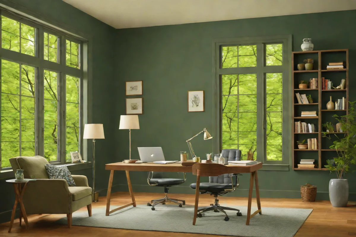
A deep, organic woodland green that contains structural charcoal highlights. Rosemary represents a bold “Confidence Move” for executives who want to build a cozy, wrapped environment. This comforting color drenches the room in an Enveloped Sanctuary feel, making the view of your Outdoor Garden blend seamlessly with your internal architecture.
Deep Mineral Blues & Slates (Analytical Precision)
4. Benjamin Moore “Hale Navy”
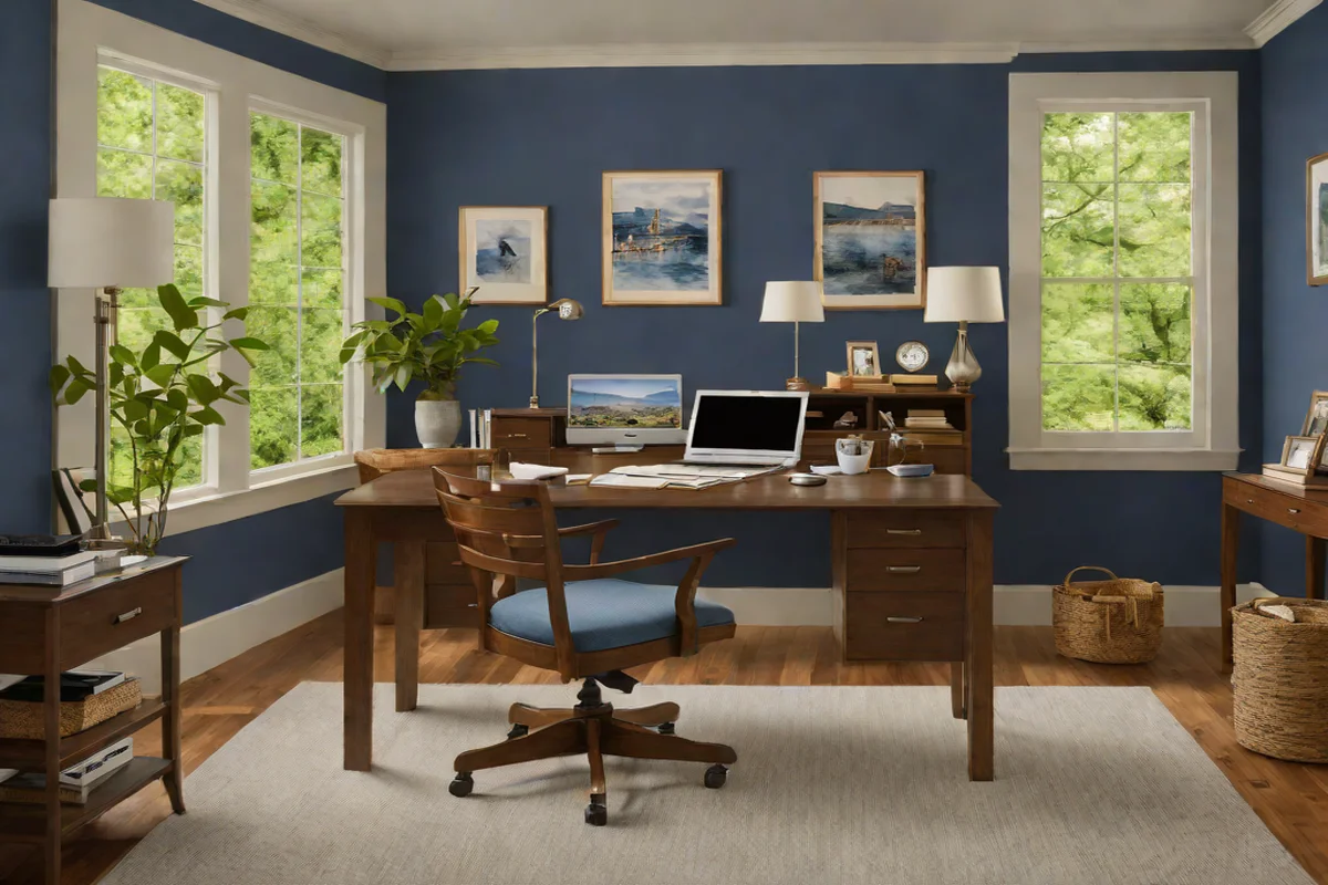
The definitive classic navy blue that serves as a powerful Grounded Anchor for remote workspaces. Hale Navy possesses a balanced blend of warm and cool undertones, providing an incredible depth that sharpens analytical thinking. This executive-level shade is a favorite for creating a professional “Power Backdrop” that radiates status and competence during critical video calls.
5. Farrow & Ball “De Nimes”
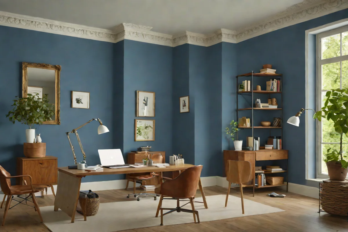
An elegant, down-to-earth denim blue that avoids looking childish by incorporating a heavy gray base. De Nimes interacts dynamically with changing natural light throughout the day, providing a beautiful patina that keeps your visual landscape interesting. It creates an excellent point of contrast when paired with rich cognac leather task chairs.
6. Sherwin-Williams “Iron Ore”
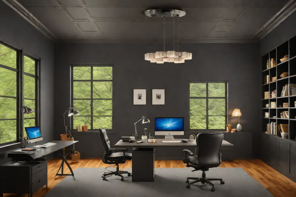
A deeply saturated, smoky obsidian charcoal that sits at the cutting edge of modern workspace design. Iron Ore is a supreme choice for tech professionals and creatives seeking an absolute Vault of Silence. This monochromatic tone eliminates room shadows, focusing all your optical energy directly onto your monitors for deep execution blocks.
Refined Sandstones & Warm Neutrals (The Low-Stimulus Spa)
7. Farrow & Ball “Stirabout”
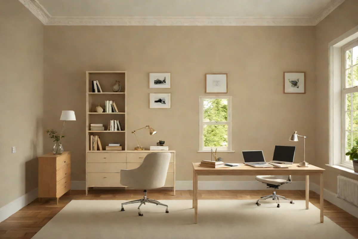
An authentic, clay-adjacent oatmeal neutral that has quickly replaced clinical whites as the favored foundation for low-stimulus office environments. Stirabout possesses subtle, warm undertones that maximize natural light without creating harsh glare, ensuring your workspace feels open, light, and beautifully styled.
8. Benjamin Moore “Swiss Coffee”
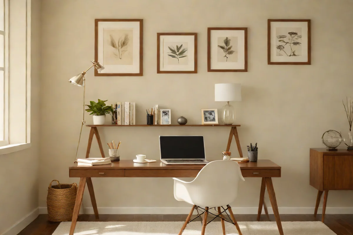
The ultimate off-white for creating a clean, bright canvas that banishes the stark, hospital-grade feel of standard commercial whites. Swiss Coffee provides a soft, warm foundation that allows you to style your space with absolute Minimalist Precision. It is the perfect neutral backdrop for a mid-century modern aesthetic focused on timber textures.
9. C2 Paint “Bone”
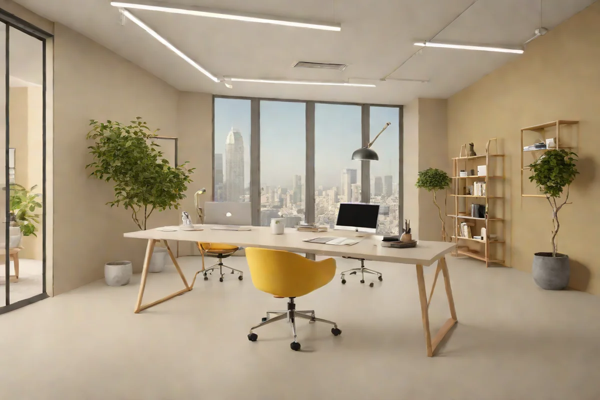
An elegant, stone-inspired neutral that utilizes minerals to achieve a sophisticated, matte depth. Bone strips away traditional yellow undertones, presenting a clean visual horizon that pairs beautifully with microcement floors and light ash floating desks. It supports an uncluttered lifestyle, reflecting the clean organization lines we cultivate in contemporary High-End Kitchens.
Sophisticated Terracottas & Warm Ochres (Energizing Momentum)
10. Benjamin Moore “Clay Beige”
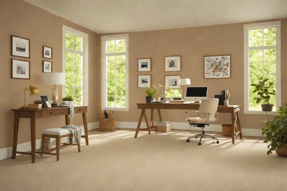
A complex, chameleon-like neutral that shifts between soft sand and warm clay depending on your lighting angles. Clay Beige introduces an indispensable layer of organic heat to the lower third of your office layout, offering an inviting atmosphere that keeps your workflow feeling relaxed yet productive.
11. Farrow & Ball “Setting Plaster”
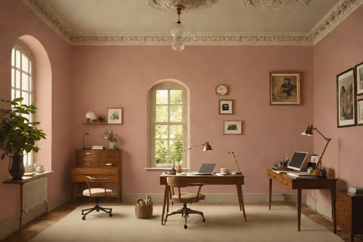
A dusty, historical pink-tan that evokes the raw texture of old European villas. Setting Plaster contains a rich blend of yellow ochre pigments, making it highly effective for boosting creative momentum and optimism without creating a chaotic environment. It adds an Artisanal Soul that pairs exquisitely with dark walnut furniture.
12. PPG “Warm Mahogany”
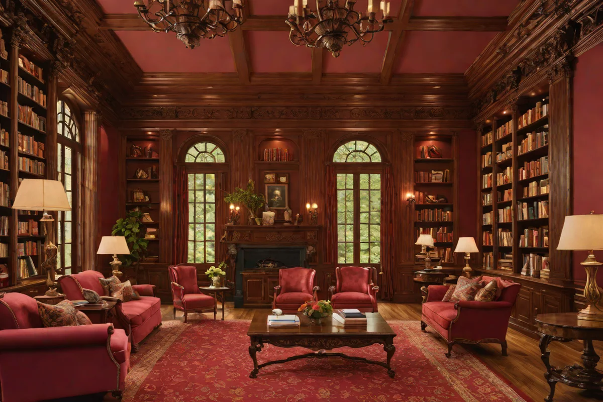
A rich, grounded deep red that sits perfectly at the intersection of earthy terracotta and luxurious wood tones. This color choice is an elite design statement, perfect for high-performance home libraries or corner workspaces. It provides an immediate sense of scale and visual weight that signals absolute professional dedication.
- Actionable Pro-Tip for Workspace Execution: Jani, when painting your home office, never overlook the “Sub-Base Preparation Ritual.” High-performance workspaces are packed with routers, screens, and shelving that can cause wear on walls. Always specify a premium, low-VOC acrylic paint with a “Scuff-Resistant” formula for your office walls. This creates a hard Mechanical Bond that handles the daily friction of moving chairs and equipment, ensuring your pristine canvas remains immaculate without requiring frequent touch-ups. This is the absolute foundation of proper Home Essentials management.
Frequently Asked Questions
Q: What paint color is most effective for increasing focus in a home office? A: Deep, nature-inspired tones like Farrow & Ball’s Green Smoke or analytical blues like Benjamin Moore’s Hale Navy are the most effective for focus. These colors possess a balanced wavelength that naturally lowers heart rates and suppresses distracting environmental stimuli. They help the brain enter a “Deep Work” state by wrapping the desk zone in a calm, orderly environment.
Q: How do you make a small home office feel bigger using paint? A: To maximize a small footprint, employ a strategy of total Color Drenching using soft spa neutrals like Benjamin Moore’s Swiss Coffee or Farrow & Ball’s Stirabout. Painting your walls, baseboards, doors, and ceiling in an identical matte shade erases traditional architectural boundaries. This optical trick expands the room’s Visual Air, making a tight layout feel breezy and open.
Q: Should my office accent wall face my desk or be behind me?A: For video-heavy remote work, position your primary color or accent wall behind your desk chair. This creates an executive-level “Power Backdrop” that frames you professionally during virtual meetings, providing excellent Inventory Clarity and reducing background clutter. Keep the wall directly in front of your monitors neutral to prevent glare and optical fatigue.